Experiential learning platform
Enhancing and renovating an online learning app
Redesign of the online learning experience to increase satisfaction and business outcomes
| Year | 2022 |
| Role | Lead Product Designer |
| Sector | Education |
About the company
The #1 experiential learning platform. Connecting learners, educators and experts in one place to execute real-world experiences to increase skills, networking and empowering learners.
Problem
80% of users access our app with desktops or tablet devices. For an app designed just for mobile devices, this could be a huge problem. In our research, we also found critical usability and accessibility issues that had to be fixed.
Furthermore, the lack of white-labelling options and the old look and feel of the app were hindrances in the expansion to corporate business, affecting our prospecting and sales processes. It was time for an update.
Personas
In this specific case and with the challenges we had, we focused on two main buckets of personas: the users of the app and the buyers.
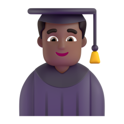
Learners
Multiple types of learners access the app, from K-12 to universities and from colleges to corporate. All of them are looking to improve and are willing to spend time enhancing their skills.
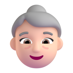
Mentors
These are professionals who are passionate about sharing their knowledge and guiding and helping students and want to improve their mentorship skills in the process. They have 5–10 years of experience in their area and available spare time.
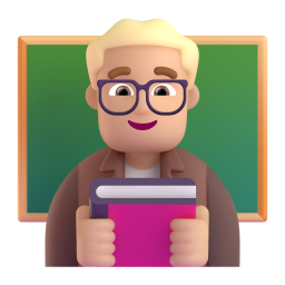
Buyers: Educators, managers or directors
Besides all the benefits of managing experiences using the application, customers have specific requirements about what they need – for example, white labelling capabilities and accessibility – and they worry about the experience for their learners.
Research
Before jumping into the design board, we spent a good amount of time talking to key people to gather insights and ideas on how to improve our application.
Internal
We collected stakeholders’ feedback, interviewed customers and analysed feature requests and defects raised in the current version of the application.
Learners and mentors
We interviewed end users to get their feedback and understand what other tools they use.
Analytics
We analysed data on user behaviour, demographics, success, devices and more to get a real view of the current status and benchmarks.
Usability
We executed usability tests for the main task in the application. This gave us an excellent framework to prioritise our focus.
Accessibility
We tested and audited the app to check our accessibility compliance and developed a plan to improve.
Findings
After the research, we had a good picture that our final users felt the app was outdated and old, and we had too many usability and accessibility issues.
This affected our sales conversion rate. We didn't meet the basic requirements of some corporate or educational institutions, which increased the urgency of improving our application.
Solution: It's time for a new app
After discussions with the product and engineering teams, we decided to work on a new version of the app that’s easier and faster. We had the opportunity to make huge improvements.
We set a plan to manage business expectations and keep the scope of the development low by trying to reuse most of what we had.
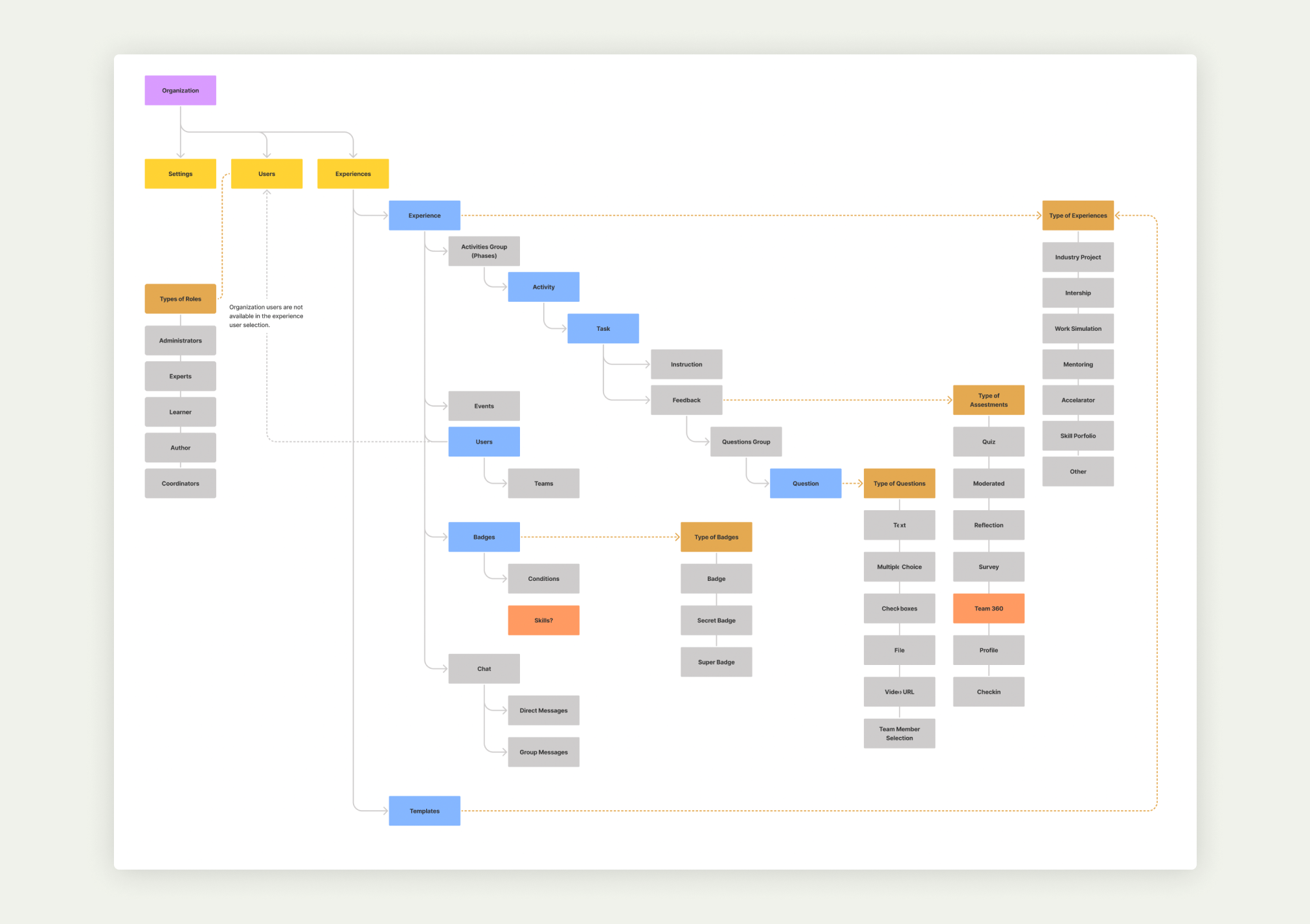
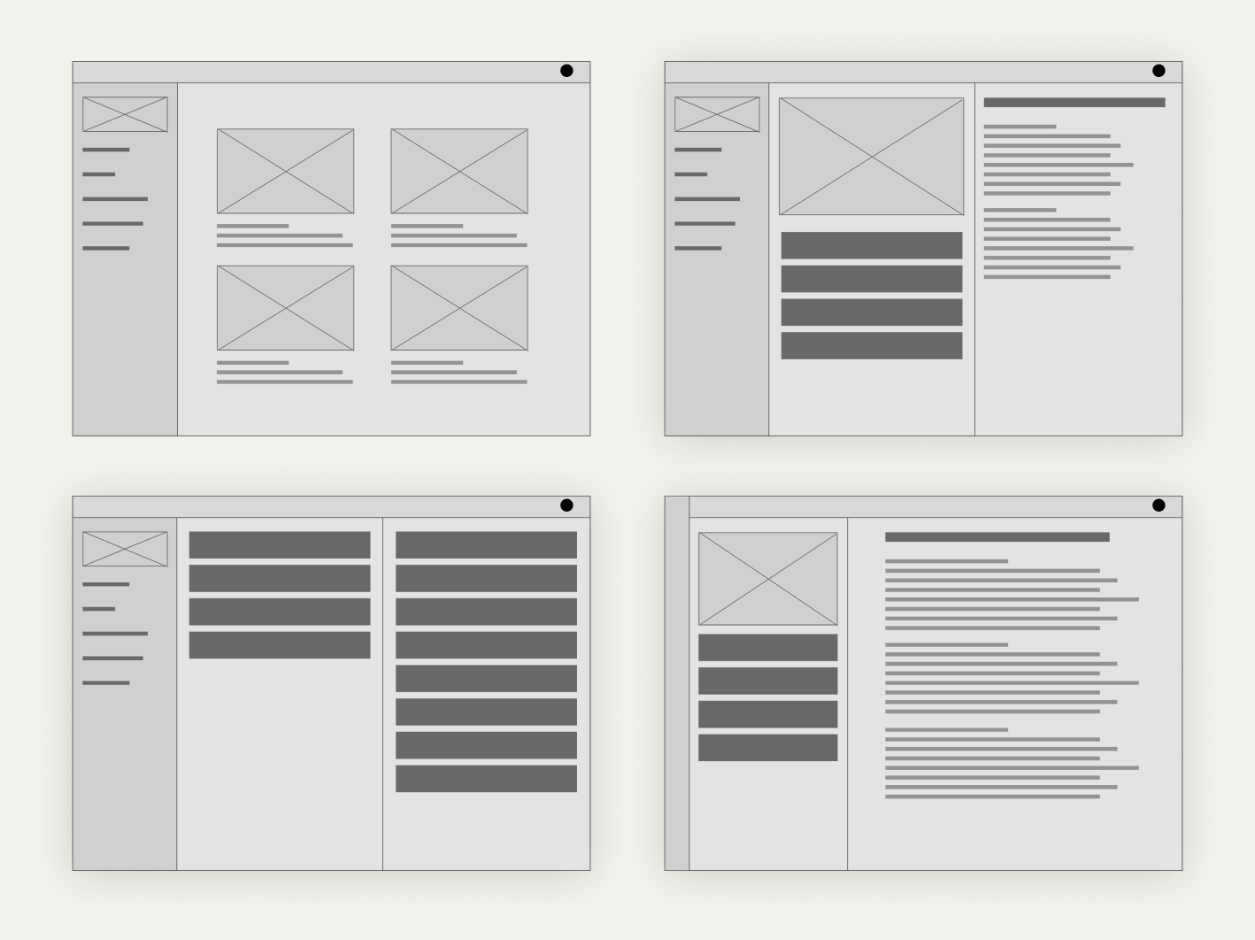
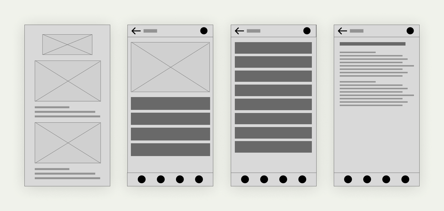
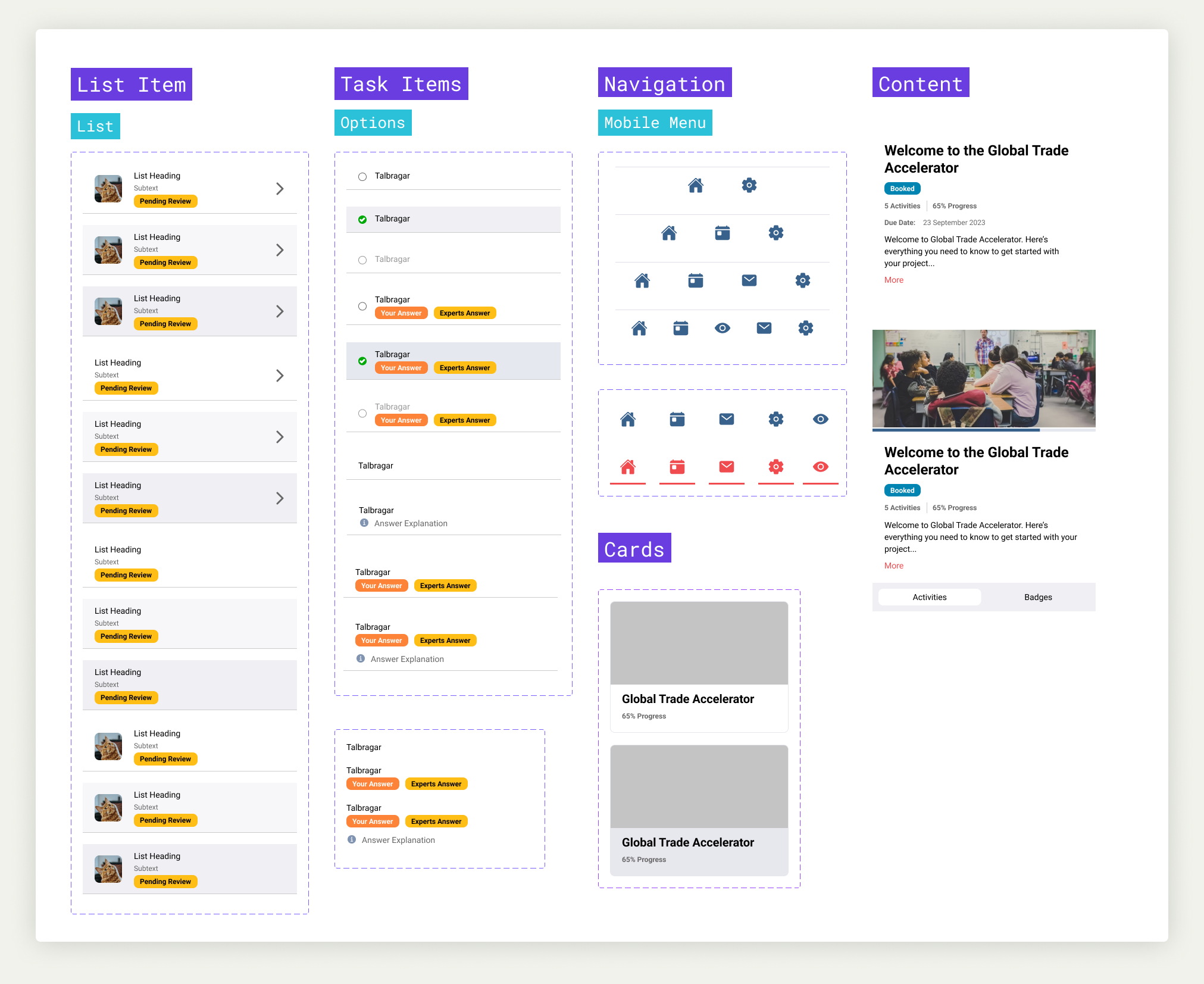
Wireframes
We had two rules to follow. One was ‘it needs to be a responsive website’, but we didn't have the time or resources to generate two versions. The other was ‘you need to use Ionic components (mobile development framework)’, so we didn't need to rebuild the whole logic behind the app and implement a new library.
We started by exploring different layouts.
Collaboration
Close collaboration with engineering was a great part of the success of the project. We connected daily to make decisions and manage the trade-offs and possibilities within our timeframes.
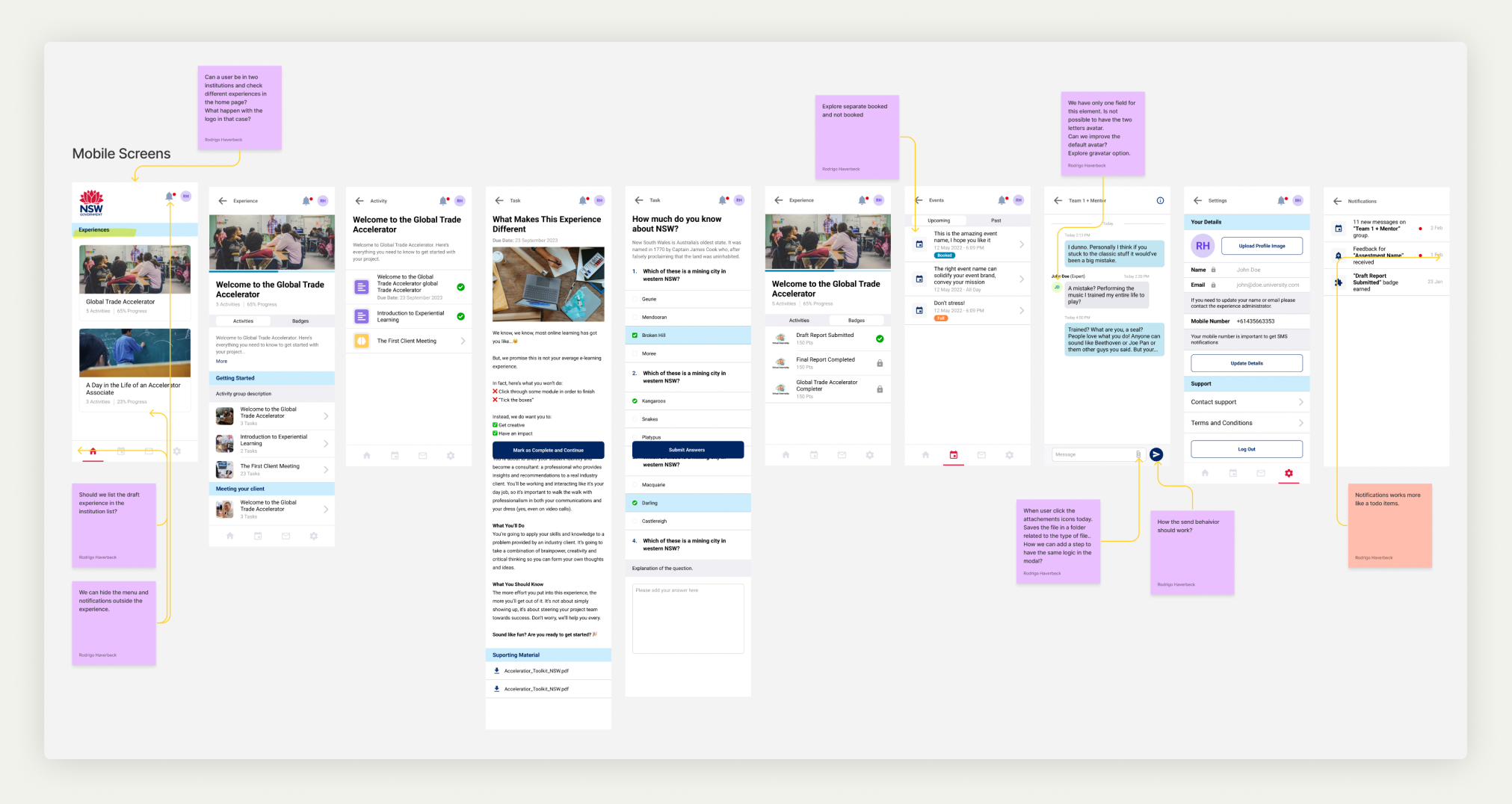
User testing
Testing was a vital part of the process. From the first wireframes to the detailed prototypes, we tested the app in each milestone to remove bias and increase our confidence about meeting our goals.
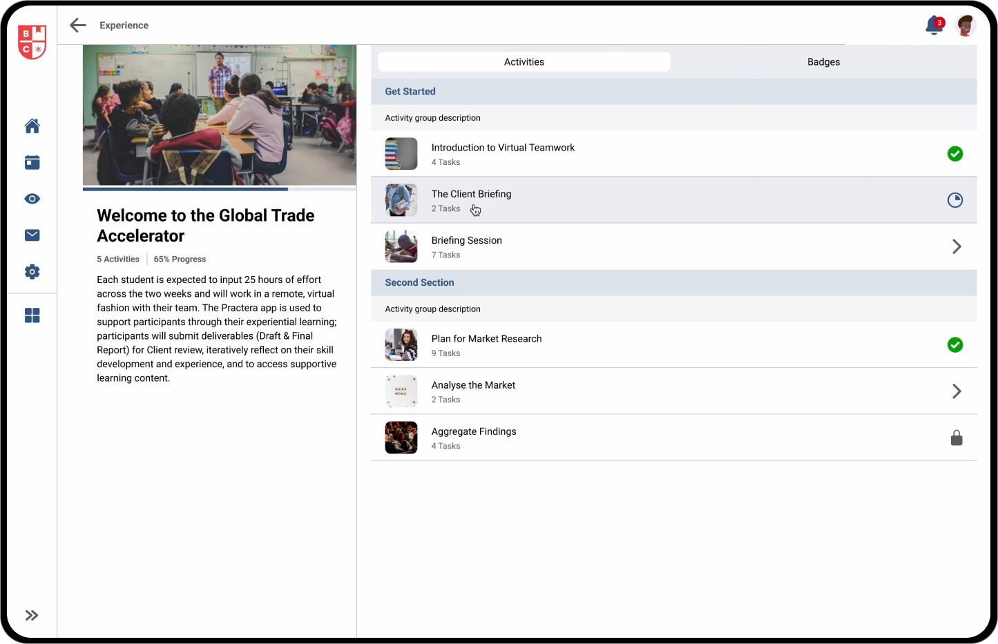
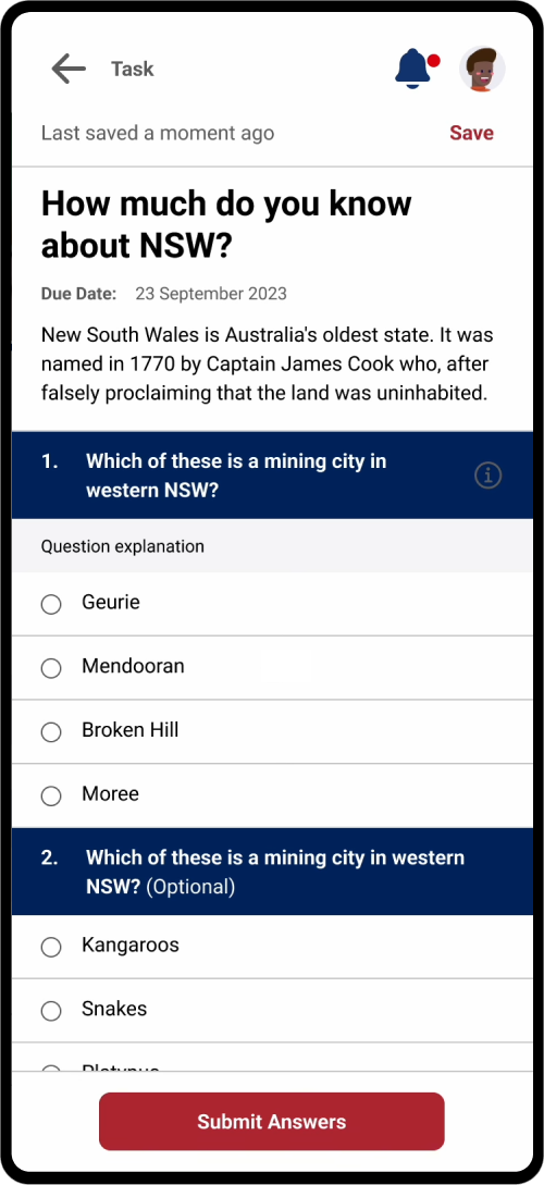
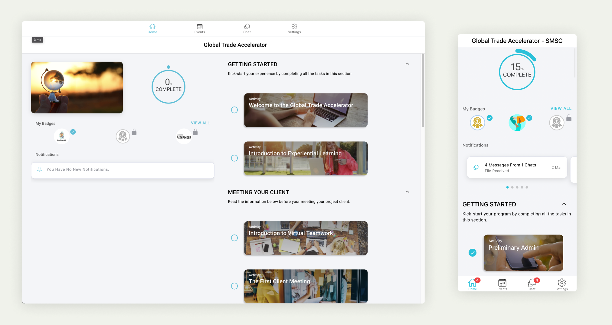
Final result
After six sprints, we were able to see our tool in action, which was better, faster and had a modern UI. The feedback received was good, and we were happy to launch a soft release to specific customers and gather real-world feedback.
We achieved our goal of making the same application work perfectly with different screen sizes and on desktops, tablets and mobile devices without losing capabilities in any of them.
We made full use of the Ionic library and created custom components to meet our requirements, which helped us to establish specific design patterns, increasing consistency and eliminating usability issues.
The team was proud of the result.
Design system
We knew we had more work to do and kept evolving and improving the application. In the process, we established a design system on Figma to speed up the prototyping of new solutions in the future by adding documentation and increasing collaborations with the engineering team.
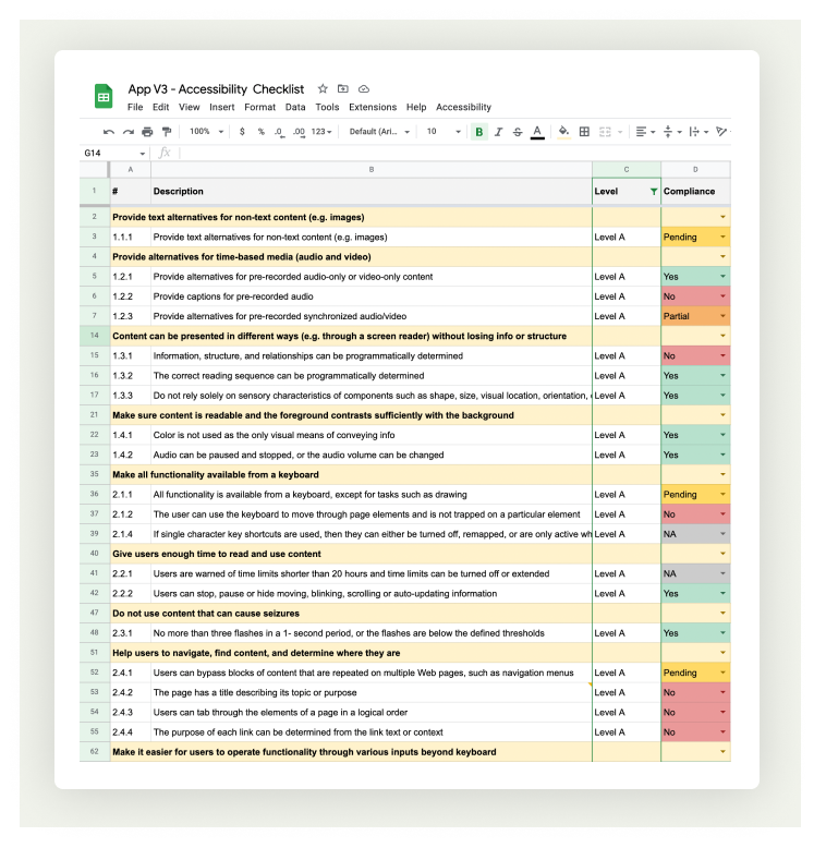
Accessibility
Accessibility is a big deal for us. We audited and tracked every requirement to be compliant at minimum level A in the first release of the new application.
We face a long path to achieve level AAA in the future, so we’re working on a strategy to get there. Fundamental changes are needed in the way we set up experiences on the admin side, and we have to add more intelligence and automation to our application.
Conclusions
We’ve gained a huge improvement in the user experience of the application. This version increased overall user satisfaction and achieved our moral objective of an inclusive digital world. At the same time, it increased interest from corporate customers.
What’s next
We’re collecting feedback on our first version to continuously improve the experience of using our application. In addition, we plan to tackle a checklist of improvements and new features to meet all our customers’ and users' requirements.
More Case Studies
Streamlining the experiential learning creation process Increasing software delivery intelligence