Software delivery platform
Increasing software delivery intelligence
Illuminating the software delivery process black box to make better decisions
| Year | 2021 |
| Role | Director of Design |
| Sector | Software Development |
About the company
The market leader of value stream management solutions for enterprise IT, improves the speed and quality of software creation by capturing, visualizing and analyzing critical indicators of every aspect of the delivery process.
Problem
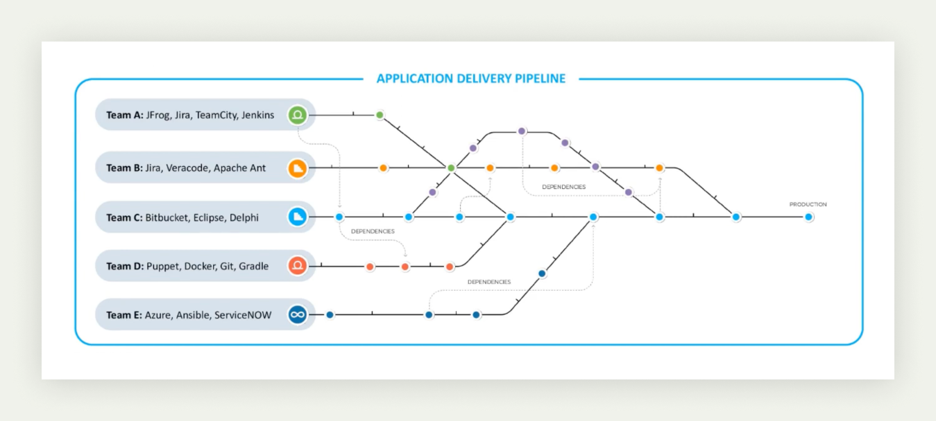
Software release management is complex at the enterprise level. Multiple release pipelines, diverse teams using different frameworks and the dependency between them increase the risk of disrupting services on productions or failing to meet strict compliance rules. The software delivery process is a black box for executives and directors
Can we connect all the information and teams to add visibility and improve the intelligence and efficiency of the software delivery process?
Research
Our customers' needs
We interviewed customers at the director level to understand their requirements and what they need to report to the executive team to identify the issues and opportunities to improve.

Listening to our experts
We ran workshops with our customer success team to understand their work in custom reports created for specific customers.

The data we have
We worked closely with the engineering team to understand what data we had and what relationships we could establish between different data sets. We also explored the data visualisation developed for specific customers to recognise the constraints, issues and success cases.
Findings
Our research was extensive, covering multiple angles and integrating various teams. In this way, we aligned the organisation with the needs of this project.
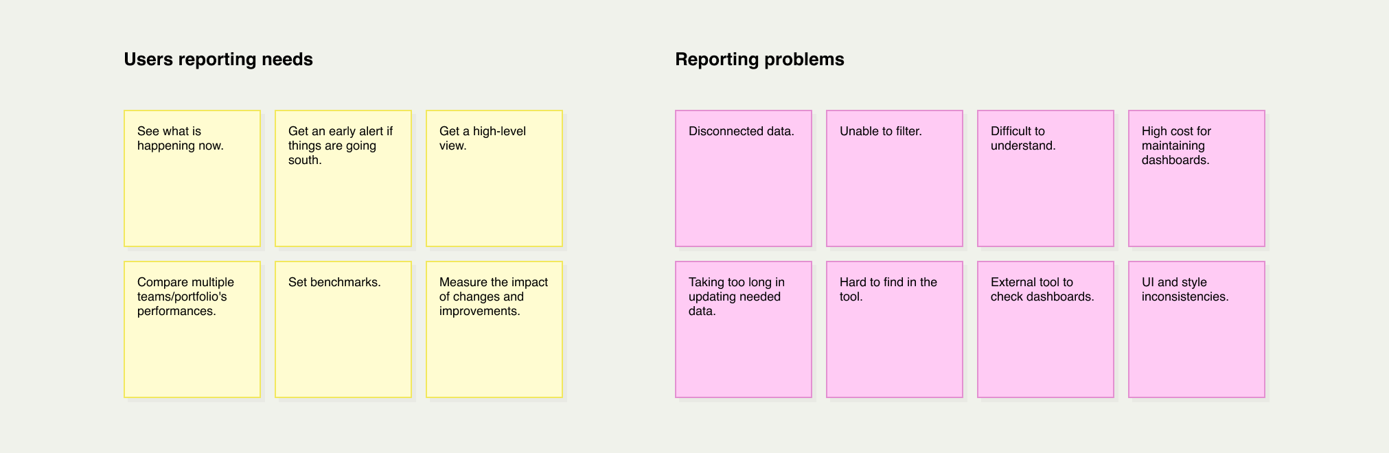
Long time to value
In the sales cycle, it was difficult to demonstrate the platform’s value. It took a huge amount of work to create a custom dashboard, delaying the closing of new deals.

Disconnected dashboards
Many customers had custom dashboards with similar reporting capabilities using our Tableau integration, and it was difficult to replicate them for new customers for specific customisations. Furthermore, our team spent too much time maintaining and updating each of them.

Lack of an ongoing work view
The majority of our reports were for the end stage of the software delivery cycle. We didn’t have a real view of the ongoing process. This made it difficult to track progress and find issues early.

Status and dependencies nightmare
Releasing software at the enterprise level is extremely complex. Release managers or product managers must handle multiple dependencies of systems every time they release a new piece of software. It’s very difficult or almost impossible to have a centralised view to create a risk assessment.

Customers generated their reports
Our customers were generating custom reports based on data aggregation from multiple tools. Besides being inconvenient, it required intensive manual work, which was extremely valuable for them. We found some interesting insights here.

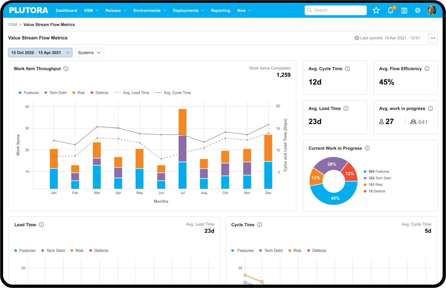
Solution: Embed the analytics
In the example below for release management, we want to answer the following questions: How is the release going? How are the stories progressing? Is the team on track?
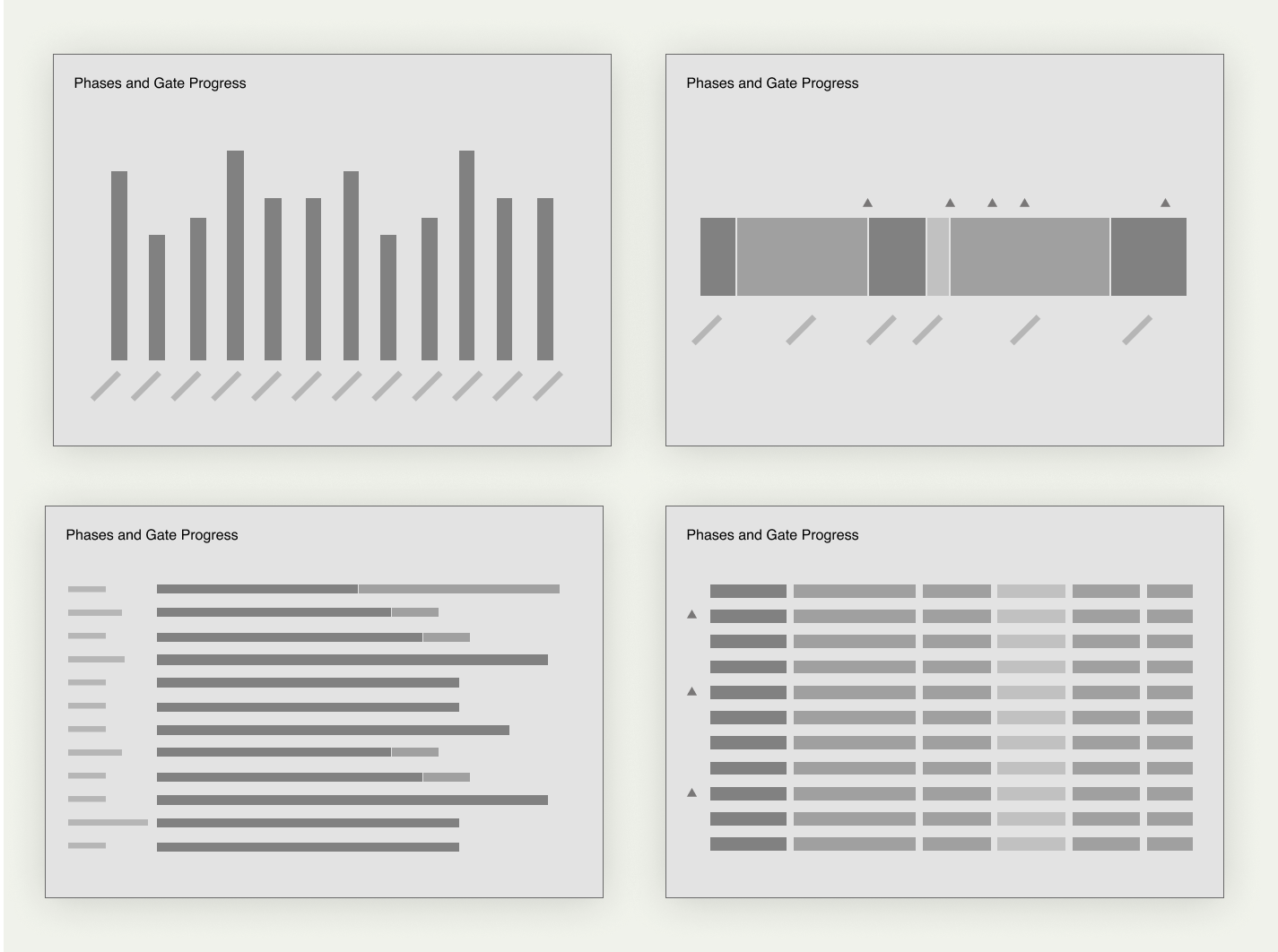
Wireframes
We used wireframes to work on some ideas for the right spot on the platform to add reports. Should it be the homepage, the entities view or the tables?
Asking for feedback
Throughout the exploration process, we asked for feedback from multiple internal stakeholders and customers to reinforce our hypothesis. In general, we were able to obtain excellent feedback and ideas on how to improve.
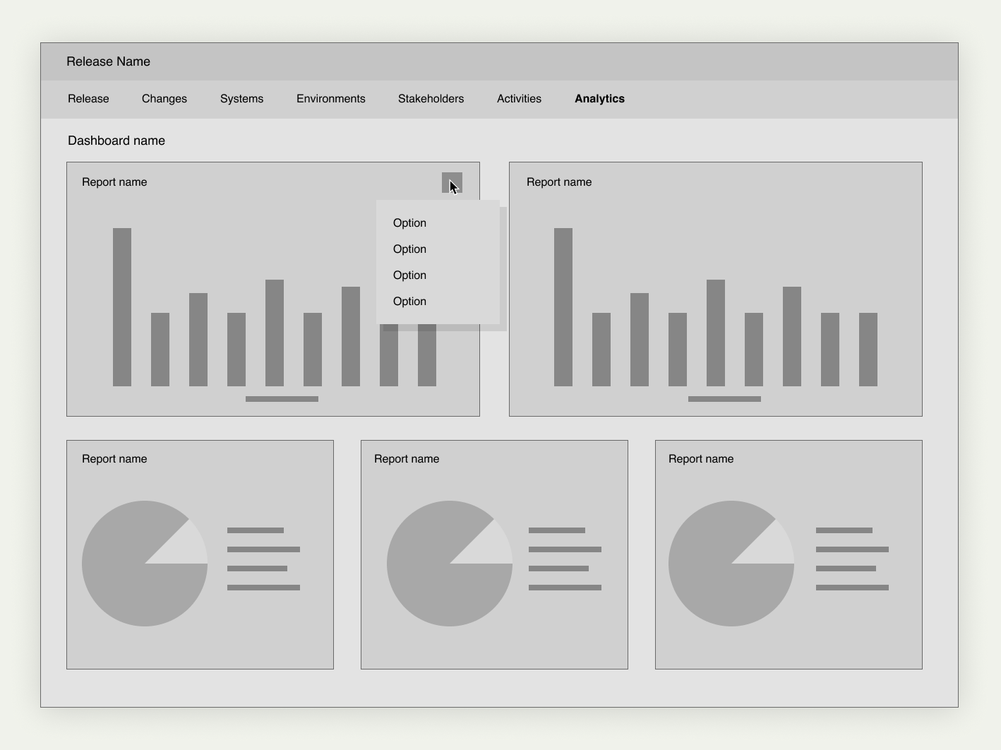
Final design
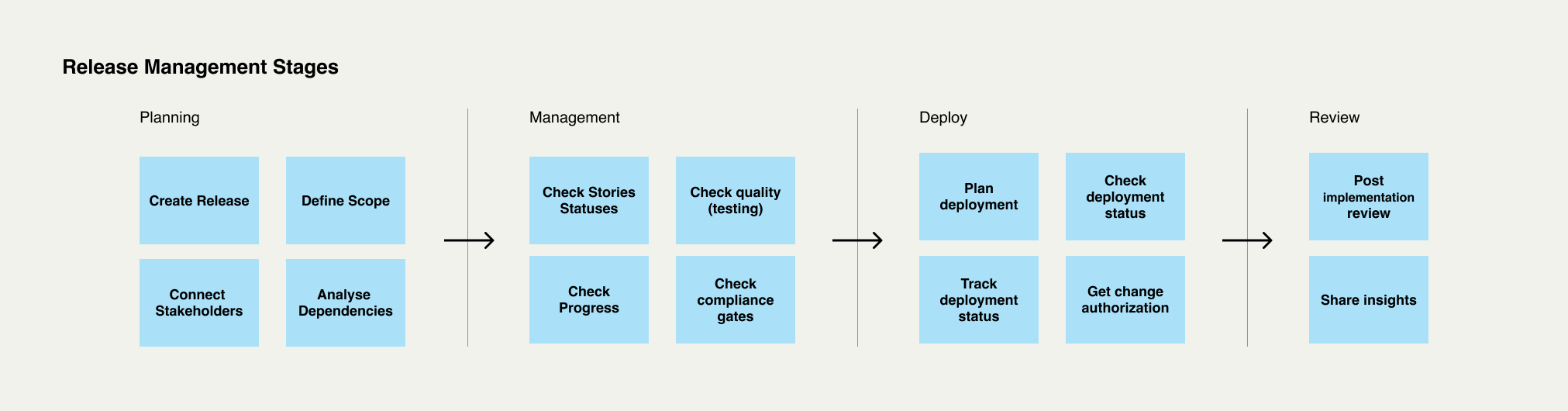
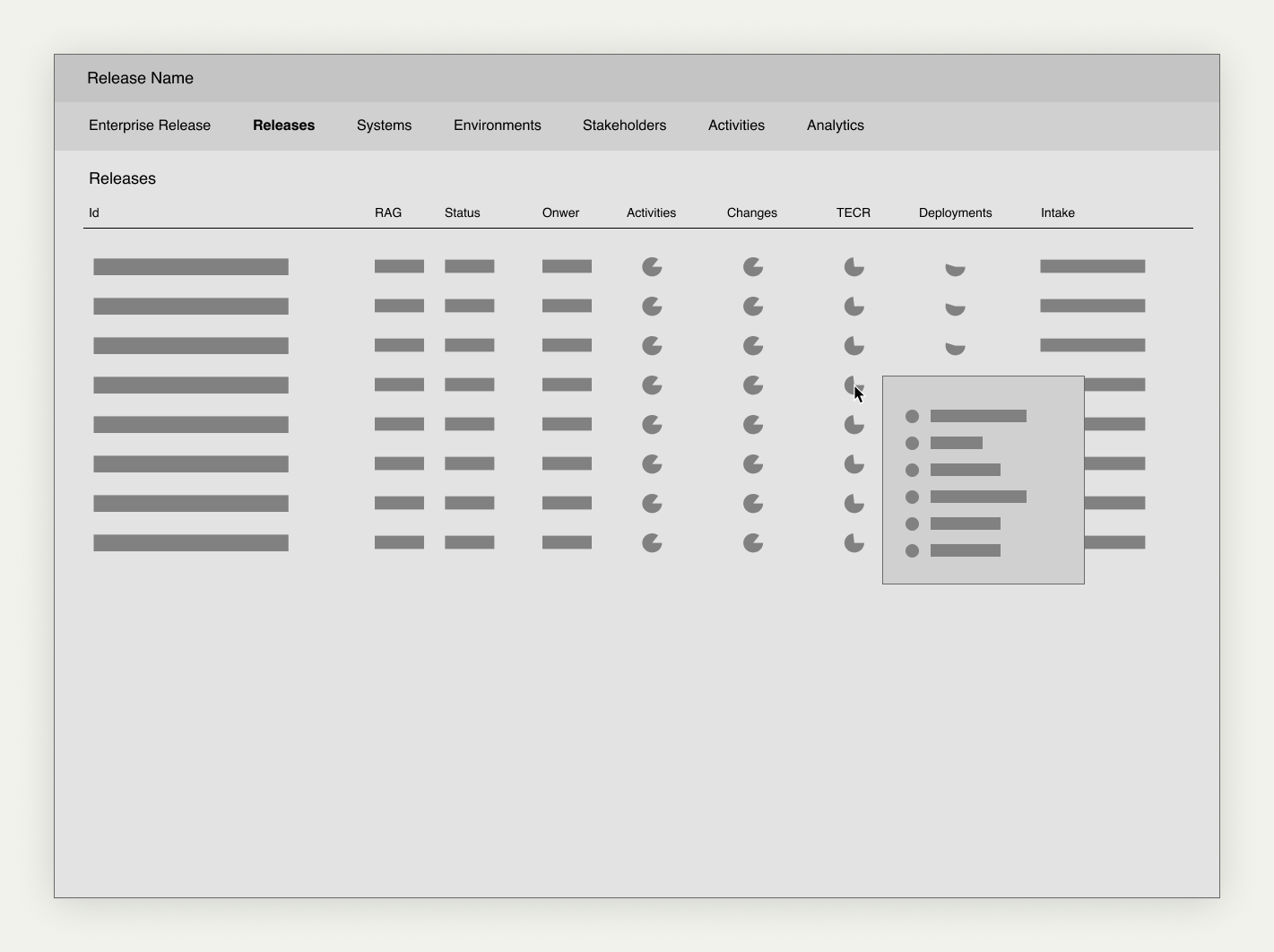
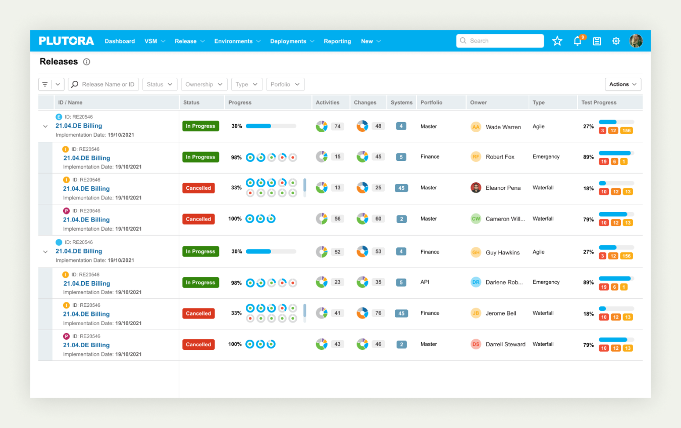
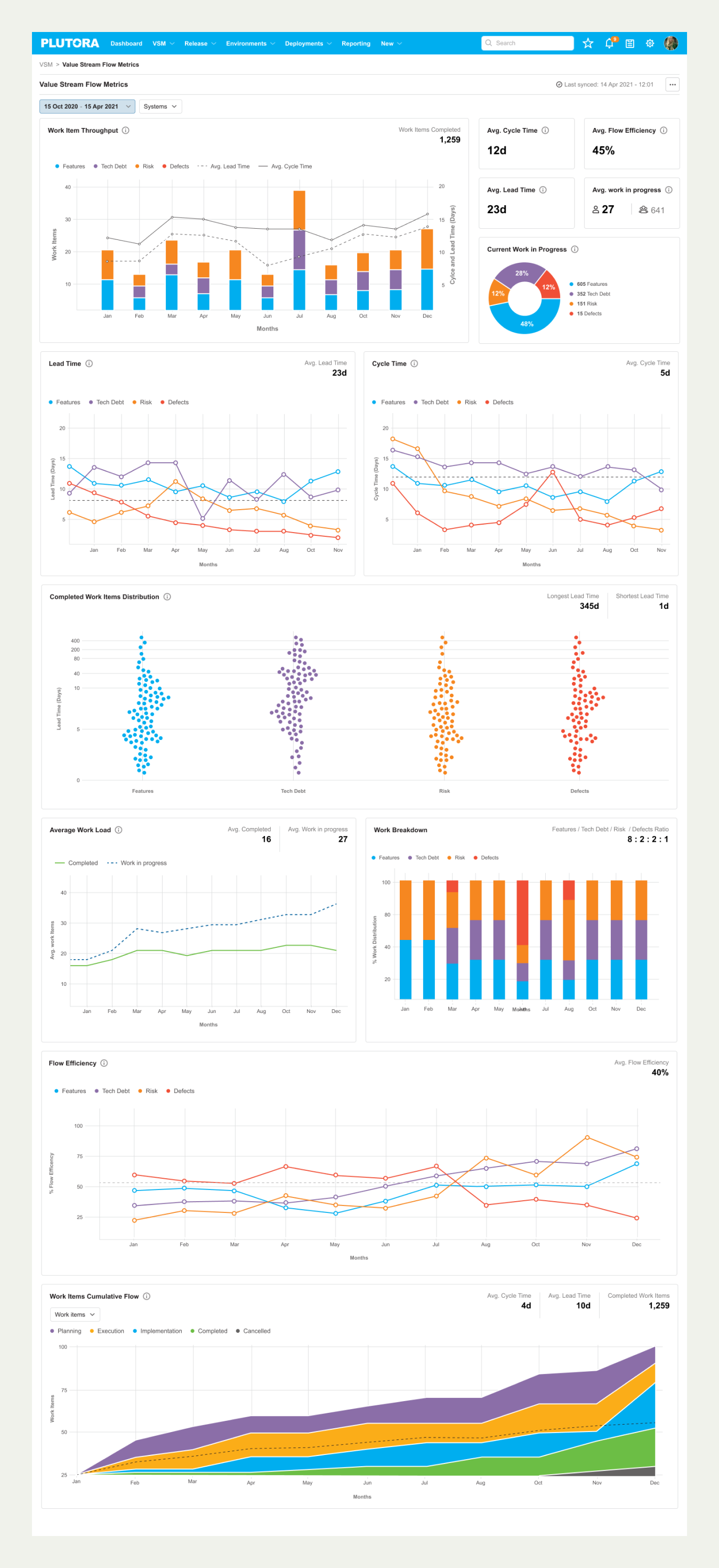
Our final solution was to integrate the relevant data and visualisation into the entity's data tables. For example, in the releases list, you can check the status of each phase, the changes and the test progress.
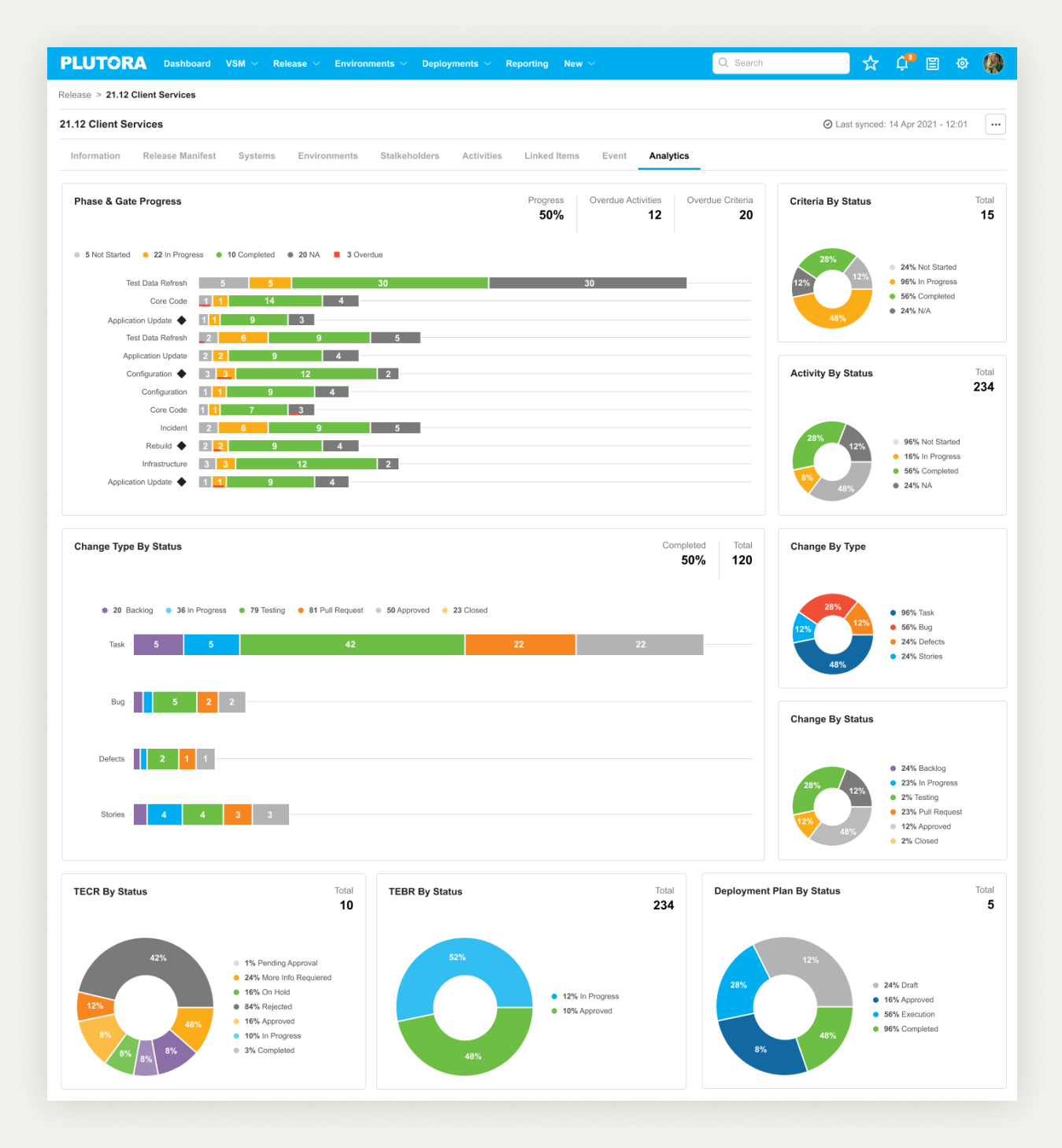
You can also have a comprehensive view of a specific ongoing release. In the analytics tabs, there’s a dashboard with multiple reports to check the status, changes, environments and deployment status.
This solution was a game changer for managing multiple releases.
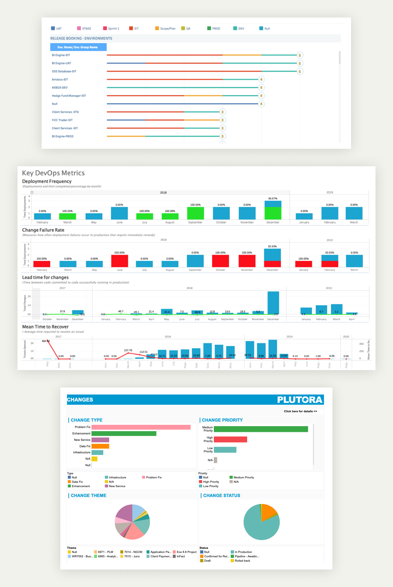
Solution: Out-of-the-box dashboards
The additional dashboards and reports to manage ongoing releases were awesome for our customers. However, we wanted to help them to track and share the performance of their software delivery factories at a high level.
We explored the most needed KPIs and what the software delivery market was asking for. Then, we started the process of generating an out-of-the-box dashboard for each function of the platform.
We wanted to answer questions like
- How fast do we deliver software?
- Where are the bottlenecks?
- How is each portfolio or team performing?
- How much work do we have pending?
- Are we adding value?
These important questions are at the core of the value that the Plutora platform adds to large enterprises.
Proof of concept
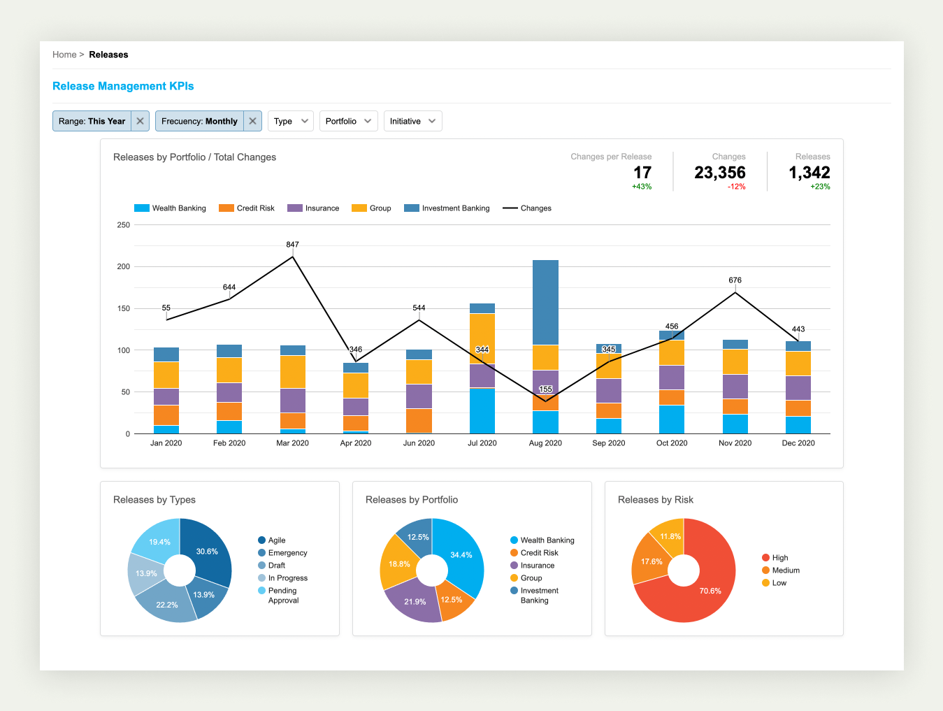
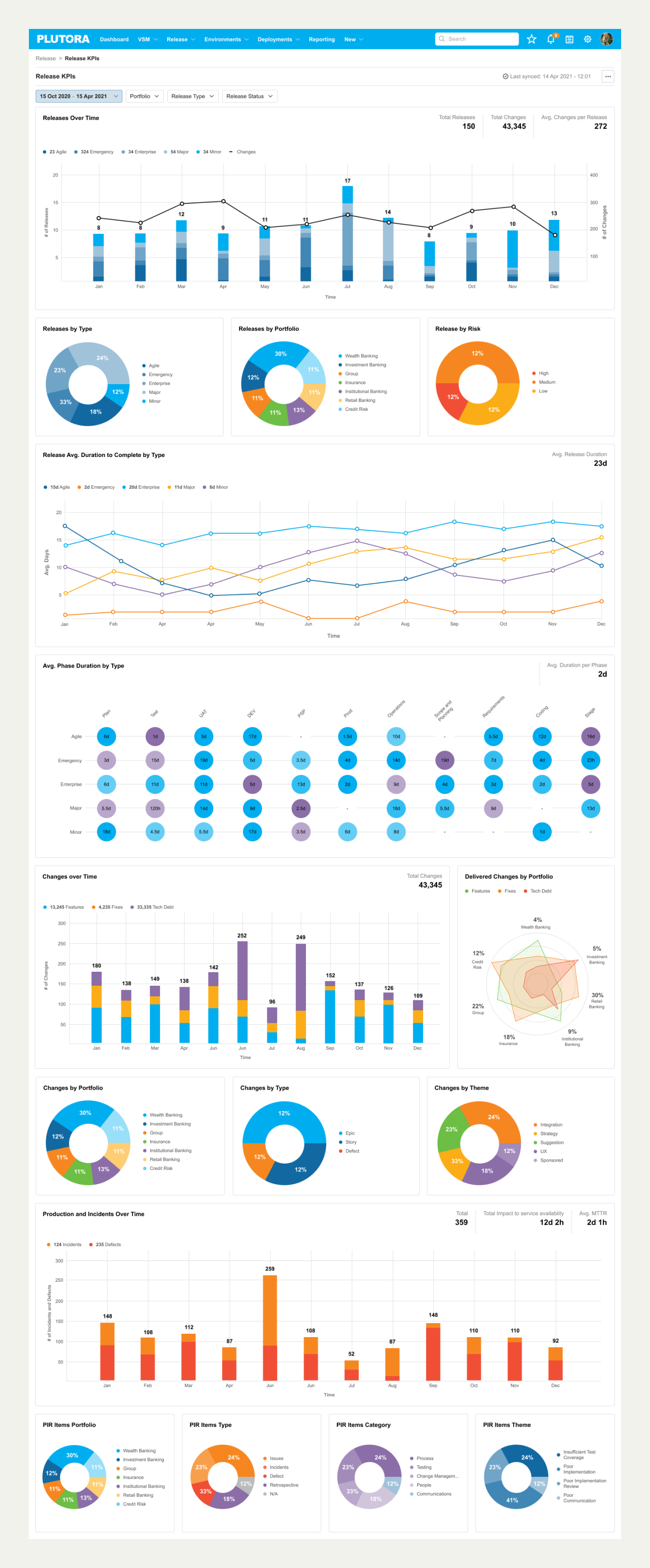
We coordinated with the engineering team to quickly elaborate on a functional proof of concept dashboard. In this case, it was for a high-level release management KPIs view.
Final design
We continued exploring how our dashboard should work. How fast can we get the data needed or how fresh should they be? We defined all the requirements with engineering and product management and began building dashboards. We started with the value stream management and release management dashboards to provide our customers with a standardised view of their performance.
Conclusion
These reports added an important layer of value to our platform. Simply presenting them made a huge difference in the sales process.
The current customers loved the reports, and we were able to see heavy use of the reports daily. It was an interesting project to work on, and the complexity of software delivery made it a challenge to find a solution that fits all the different scenarios.
The approach of having basic reports and scaling from there was correct to show the platform in all its potential.
What’s next
- Increase the number of out-of-the-box dashboards to cover the four main pillars of the platform: release, pre-production environment, deployment and planning.
- Increase the filters and drill-in capabilities of the reports by adding an extra layer of insight discovery for our users.
- Provide the option of generating custom reports on the platform to our customers by using multiple widgets and a smart rule system.
- Let the user export data or integrate them with third-party tools to have the option of correlating with their dataset.
More Case Studies
Enhancing and renovating an online learning app Setting the strategy to implement a design system