Experiential Learning Platform
Adding intelligence to the skill creation process
Increasing the visibility, efficiency and outcomes of experiential learning
| Year | 2022 |
| Role | Lead Product Designer |
| Sector | Education |
About the company
The #1 experiential learning platform. Connecting learners, educators and experts in one place to execute real-world experiences to increase skills, networking and empowering learners.
Problem
Educators and managers running experiences on the platform don’t have a view of the learners' progress and the impact on their skills progression. This lack of visibility makes it hard to manage large cohorts, increasing the amount of manual work and decreasing outcomes.
Research
Customers
We conducted multiple interviews with our actual customers to help us identify the different roles’ needs in terms of success measurement. We also reviewed custom-made reports by our customer success team for specific large customers.

Programs team
The team has an important function in the setup and day-to-day running of experiences. They help us to identify all the blind spots and specific needs in terms of improving experience visibility and performance.

Data team
We organised a workshop with the data team who actively work on improvements and better ways to store and access our data. We reviewed the custom reports created on QuickSight for key customers and got their feedback and constraints about the possibilities of implementing them on the platform.

Customer success team
We collected all the requirements that the customer success team obtained from the large customers and our responses to them. This helped us to understand the needs and feasibility from their point of view.

Engineering team
We developed a few basic reports in the previous version of the platform. The engineering team had some ideas on how to improve performance and remove the barriers to implementing stronger analytics.

Findings
Amazing reports
We had exceptional customer reports to show the value of running experiences on our platform. However, they were custom solutions for specific customers that weren’t easy to replicate in different use cases.
Standardised data
Every experience we build is different and unique. This makes it tough to create analytics that work for every customer. It’s a huge opportunity to standardise some interaction elements as enrolment, satisfaction or assessment. This would provide us with the relations between items to generate better reporting.
Tracking performance
We have satisfactory reporting at the end of an experience. However, we don’t have good analytics within it. More robust reporting during the progress of weeks or activities would give managers the ability to improve the outcomes of the experiences.

Granularity
We needed to set the option to drill in our analytics, such as questions regarding a whole cohort, a team’s performance or a specific learner’s progress. Filtering capabilities would help managers dig into different scenarios to find insights to improve the experiences’ performance.

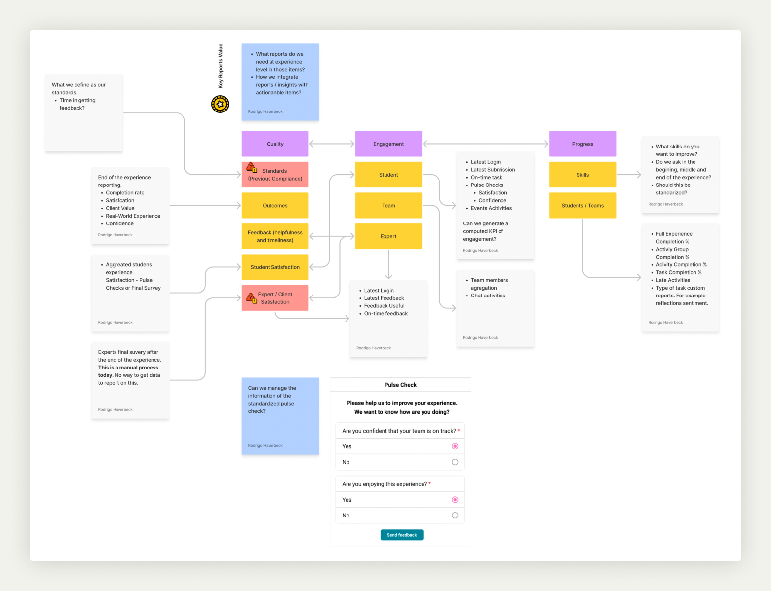
Key business value
Analytics is one of the key values of the platform and makes it different from other learning management systems. Having the visibility of an experience running and the skills being generated was a game-changing value proposition for the customers.

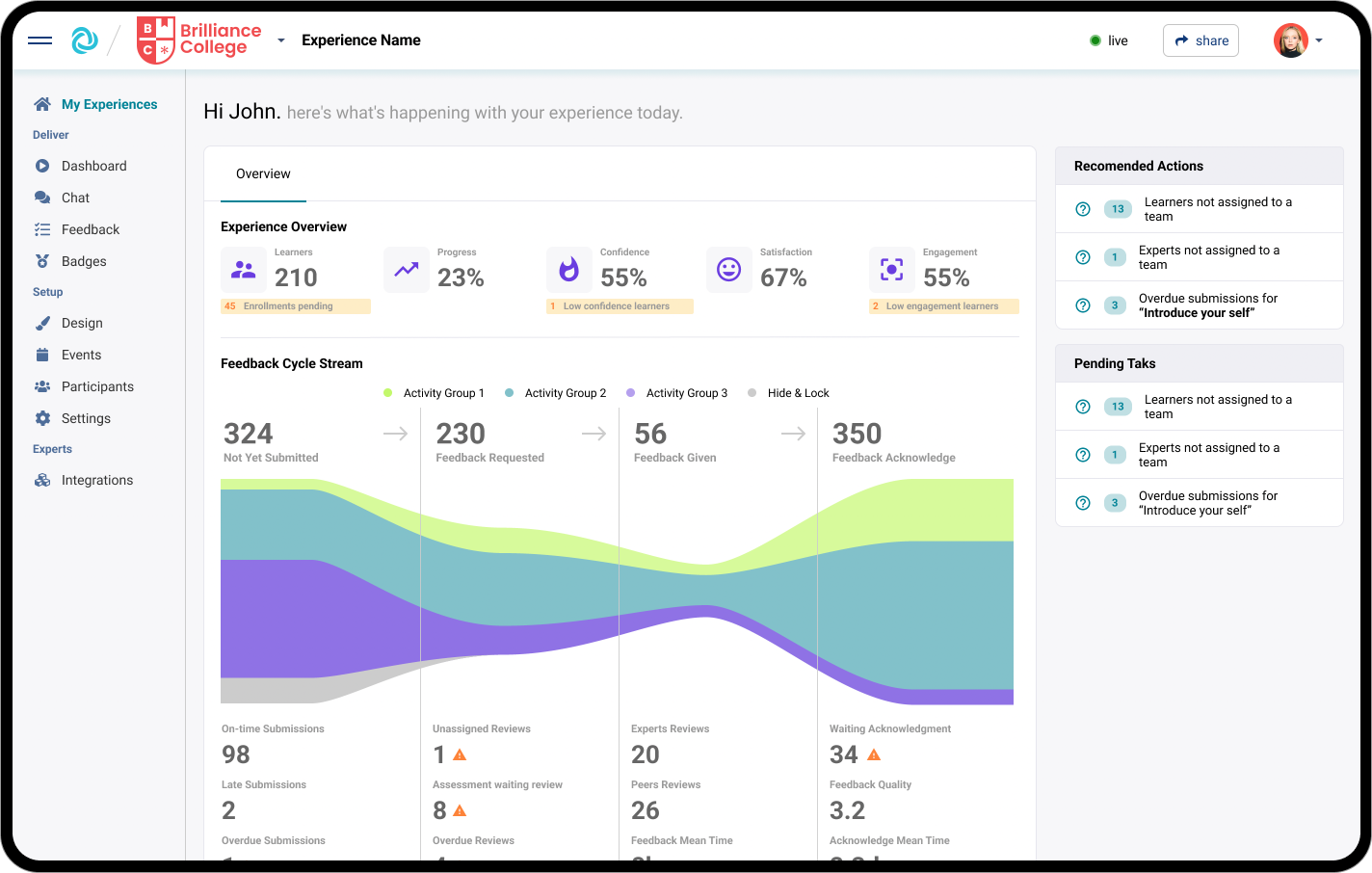
Solution: Out-of-the-box dashboards
We decided to implement a high-level, out-of-the-box dashboard for the experiences to help managers execute, track and measure impacts.
Based on our research, we defined the most important and relevant KPIs, status, engagement, progress and quality. With that in mind, we started to work on the wireframes.
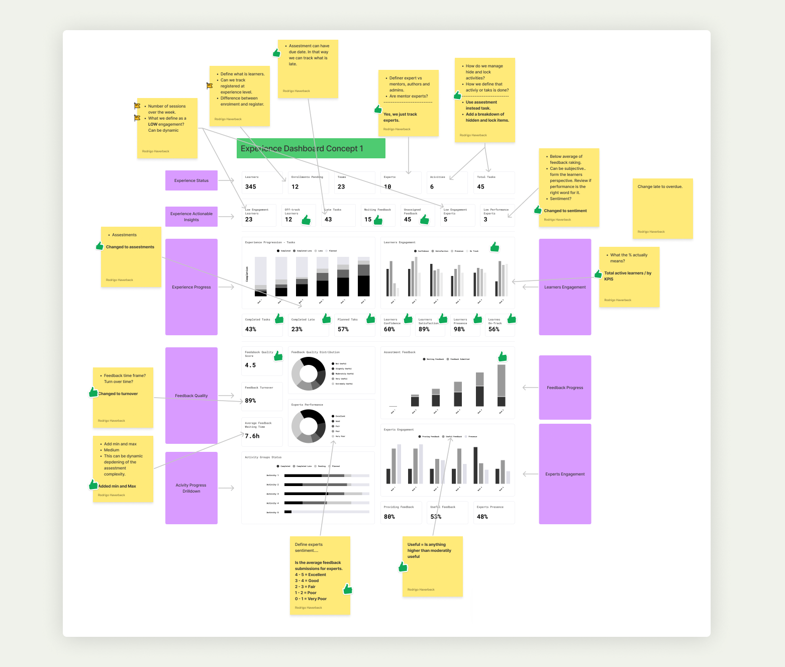
We explored the best section in the platform to position the dashboard. After multiple tests, we defined the homepage of the experience as the most relevant place, as it keeps all the stakeholders involved in the experience’s progress and issues.
We iterated in different ways to visualise the flow of work, and we created a feedback cycle stream to show the cycle of tasks, feedback and acknowledgment.
Furthermore, in one view, the manager can have a holistic view of the experience and actionable indicators of late items or low performance.
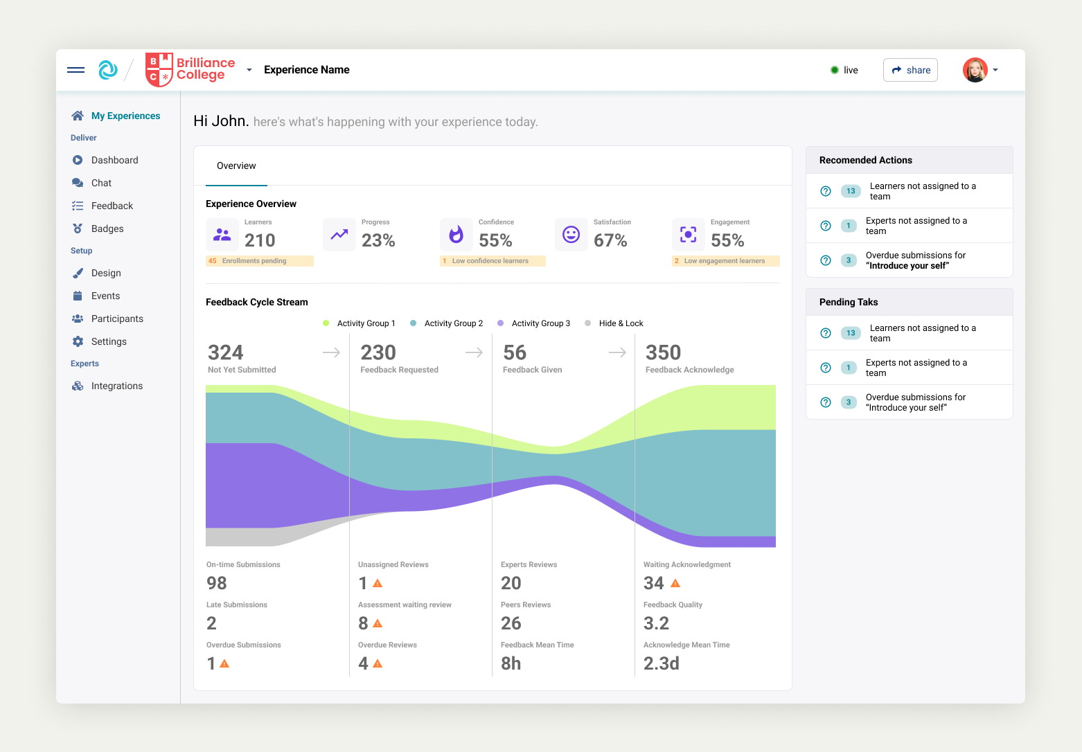
This report is a game changer for managers. However, if something is missing, it isn't useful because it isn’t actionable. We decided to explore further to provide more value to our users.
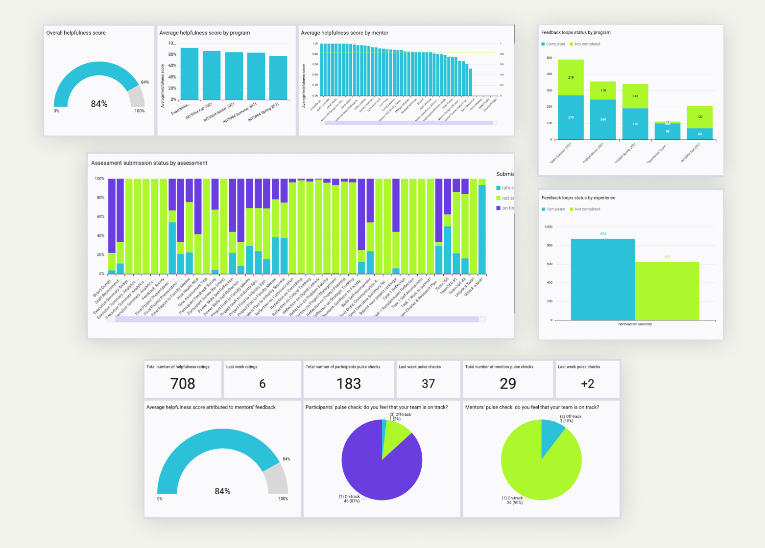
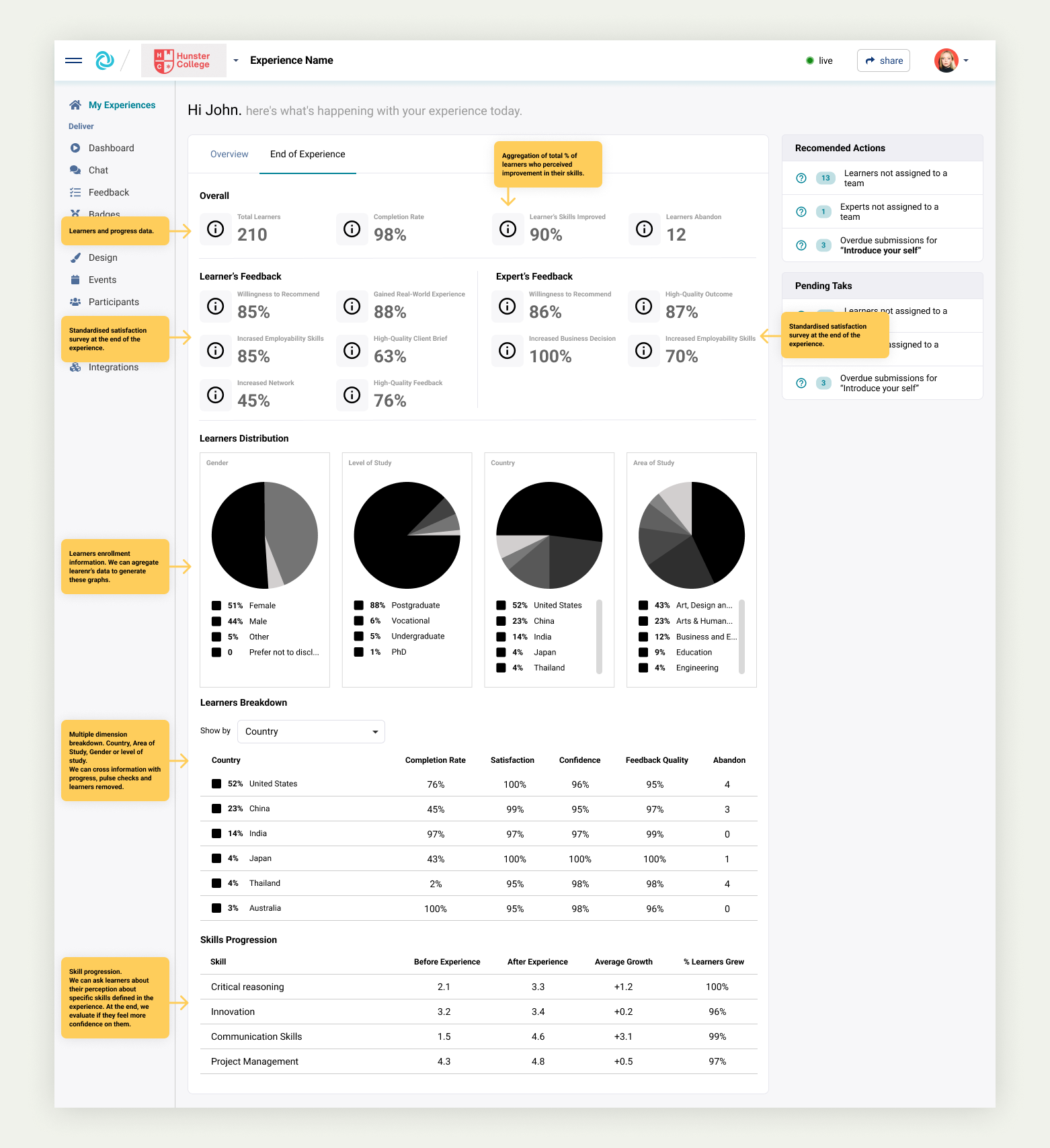
Solution: Embed the analytics
With the need to increase the actionable KPIs, we decided to transform our data tables into live reports and add reports to specific entities on the platform.
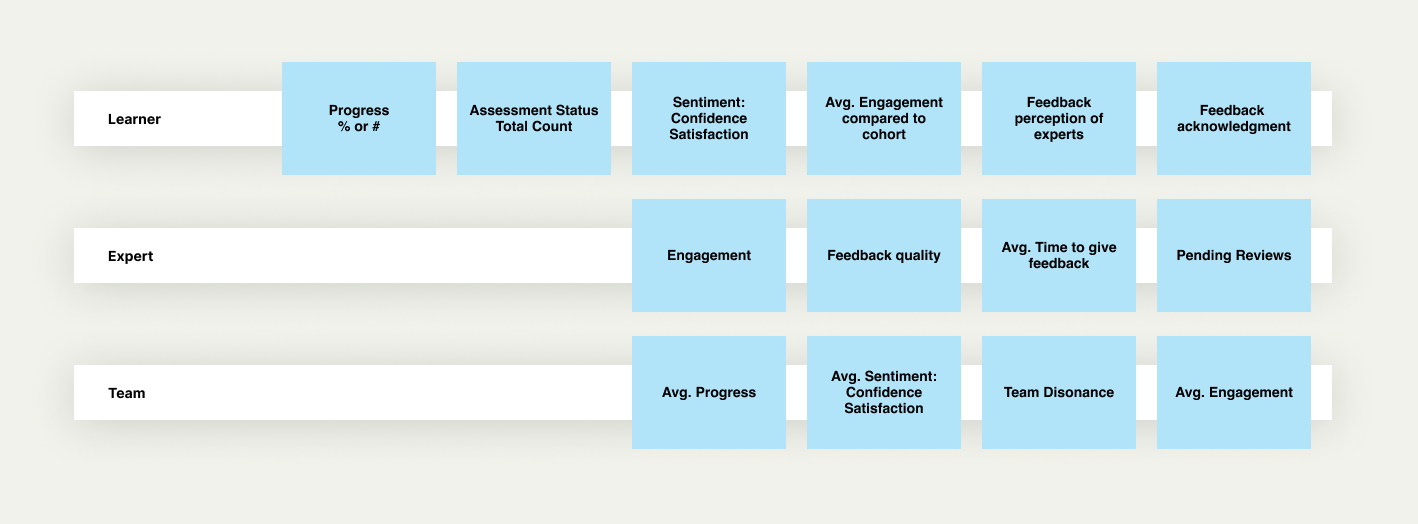
Based on the research, we defined the most important KPIs for each type of user and explored the feasibility of showing the needed data.
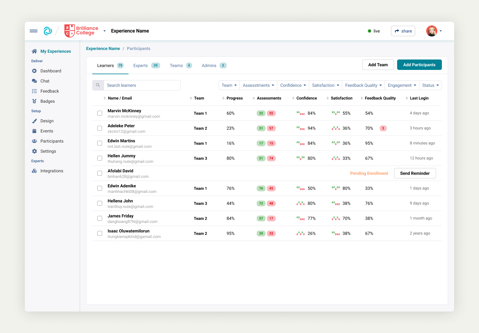
Users can see the performance of the experience from multiple angles, filter and take bulk actions when needed.
Altogether
We’ve improved the ways of interacting, tracking and increasing the performance of experiences using the platform. In this short video below, you can see how easy it is to identify issues or problems on multiple levels.
Conclusion
Power users love our data
Our data and insights are delivering a huge amount of value to power users, The options to drill in from a report or filter the learners or experts to execute bulk actions are saving them time and improving their efficiency.

Unlike other learning management systems
The platform most powerful tools are its intelligence and measurable outcomes. Powerful reporting and smart insight capabilities are also huge business advantages.

Increase automation
The amount of generated data and actionable insights can be overwhelming in large cohorts. We aim to improve how the platform can automatically respond to actions to decrease the amount of user intervention whenever possible.

Standardisation vs customisation
We face the unique task of structuring and standardising our data without losing the customisation that large organisations need. This is a key challenge to increase the intelligence we can offer to our customers.

Next steps
- Expand our out-the-box dashboard with more verticals: experts, types of experiences, learners and whole institution reports.
- Increase the intelligence of the platform by automating or offering a solution to the user based on the insights found.
- Add reporting on assessments, 360 reviews, quizzes and surveys.
- Give the user the ability to create custom reports.
More Case Studies
Optimising the Checkout Process for Higher Conversions Streamlining the experiential learning creation process